Categories

Accordion (1) AfterEffects (1) Application (2) Automobile (1) Banking (1) Chrome (1) Cinema4D (2) Coding (2) Corel Draw (1) CSS (4) CSS3 (11) Design (2) Dropdown (1) Film (1) Finance (1) FinTech (1) Gateways (1) HTML (4) HTML5 (4) JavaScript (7) KDE (2) Layout (1) Login (1) LungoJs (1) Menu (3) Menubar (2) Movies (1) Navigation (2) Open Source (4) Panel (1) Payment (1) Photo Gallery (1) Photoshop (2) PHP (3) Production (1) Rekonq (2) Sony Vegas Pro (1) Startups (1) Taskware (1) Technology (1) Ticker (1) Validation (1) Website (3) XHTML (1)

Sunday, November 18, 2012

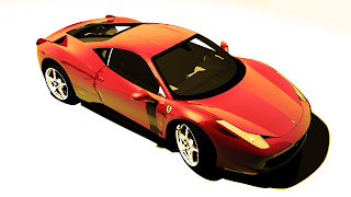
Back in 3D

After a really long break from blogging, I'm back on the eve of my semester exams. Things got really catchy as I was bored with web design and decided to take some time off it. Meanwhile I did do something new. :) I concentrated on 3D design, not just any 3D design but real time automobile modelling. Being a mechanical engineer, it was a hell lot interesting and surprisingly some of the subjects in my course, especially CAD/CAM, helped me a lot (I didn't expect them to). After a lot of hard work, research and practice I came up with good models of the Lamborghini Murcialago SV and Ferrari 458 Italia. I worked them in Cinema4D and put don the finishing touch in Photoshop. Although the photoshopping was just to put a few filters to enhance the colours.

 Well, it would have been much easier if I did these in Maya, but I'm well suited to the C4D environment. It's really easy and you do get quite a lot of handy tutorials online that will help you to get through with the HyperNURBS and Wireframe designing (believe me, these are the tough parts of designing, material designing and lighting is a lot simpler). If you are new to 3D modelling, you can check out C4Dcafe and other websites for some really cool plugins and tutorials. These include both animations and still image designing and the important part - rendering.

If you are interested in getting the source files of these models, just send me a mail at amitdatta1806082599@gmail.com

Thursday, July 26, 2012

Vacation Tracker on Android - LungoJs


After hanging around a lot with PHP and CSS, development of web apps for PC's got somewhat monotonous. Hence, I decided to move on to develops web apps for the tablet and the smart phones. Being the possessor of a Sony Xperia U, Android was the obvious choice of platform. Instead of hard coding the entire application with javaScript I decided to use the framework called LungoJs. The first look at the framework convinced me that it is definitely cool, but lack of documentation and support made it really cumbersome. It took a hell lot of time for me to figure out how to use the Framework. At this point I must tell you that it is not at all that tough as I felt, its just the lack of support.  
 The application itself is very simple. The routine is stored in a MySQL database. All I need to do is to update the routine if I'm absent in a particular class. The absent dates are stored in the database. The application automatically calculates the percentage of classes I have attended in each subject and warns me if I'm low on attendance.
The application is currently in alpha stage of development and major features have already been implemented. The last module that I'm working on is trying out a algorithm that will help me to plan my classes so that I can cope up if I'm low on attendance. A bit of AI ;)


Thursday, July 12, 2012

Taskware

Finally my first corporate based application reaches testing phase. Taskware, as it is being called, is an advanced task management application that synchronizes all your tasks, projects, contacts and notes over the network. The thing that really makes it different from other task management softwares is that every part of information can be shared over the network with someone if necessary. Few additional features that makes this application special is its cloud storage - file sharing system, the internal messaging system and the accumulation of contacts sensibly. Security has also been taken ample care off, as corporate solutions always require neck tight security.
I'm looking forward to the results of the first real time test of Taskware over the National Institute of Technology Durgapur servers somewhere in the near future.

The Taskware Dashboard

Wednesday, May 16, 2012

Client side validation vs Server side validation

It is quite a fun developing a web application this summer for NITD Alumni. Working at such a professional level is tough, but it definitely teaches you plenty of new stuff.
While working on this project I came across a major problem with validation. Since the application is supposed to store profiles of alumni's and present students, we need a lot of validation work. Any wrong data will make the database useless, and also we want to put the best user experience forward. So the idea is to give the user the least number of controls and still collect the most amount of data possible.
Initially, I decided to use client side validation using javascript as that would speed up the process as well provide an enhanced user experience. But how much I tried, javascript was easy to hack and anyone could submit garbage data into the form. So finally it was decided to do server side validation using PHP.
Now to make our plans, we did both client side and server side validation. The obvious question is how will this help! Well the client side validation does most of the work, make the interface fast to use and gives a superior user interface. On the other hand the server side code gives a secure backend. So the before the data is written onto the database, the server side validation makes it foolproof and writes it down.
Hence, for a site to work out proper and secure validation techniques, it needs to have both client side and server side validation.

P.S. For those of you looking for client side validation, look out for the jquery.validate.js and additional-methods.js. They contain almost all the necessary validations. And obviously you can write down a few of your own. :)

Sunday, March 25, 2012

300 not out

Coding and web design has always been my strengths, but another favourite hobby of mine has been to make posters. After coming over to college this hobby turned into a passion. Clubs and communities helped me flourish and gave me ample oppurtunity to learn. They allowed me to commit mistakes, learn from them and then rectify them. After designing for more than 14 months, finally I've completed making 300 posters in this college. It has been a tough journey but it was a whole lot of experience which not only improved my skills but also increased my level of artistic ideas. Election posters to promotion posters, I've done it all. Certificates, ID cards, flyers and flexes. These brought a whole lot of versatility in me making me adapt to different situation. I also designed 4 brochures meanwhile - 4 full fledged books. It was an amazing journey and it is to continue.

Monday, March 12, 2012

WYSIWYG Editor: Planned!!

Finally 'm working on the WYSIWYG editor that I had planned to do a while ago. All the development stages are almost planned. Research work almost done. And I'm ready to code for it!
The development stages:
  • The most basic functionality that a WYSIWYG editor has is the styling, alignment and font options. So for the editor I'm working on, I assume it to be the most important options and hence I put them on stage 1 of my development process. Along with these hyperlinks and inserting images will also be a part of this stage. Font-colors, backgrounds and highlighting will also be taken care of. Indentation was a problem, but with a bit of research this problem was also sorted out.
  • The second stage will consist of advanced options like bullets, numbering, emoticons, symbols and date/time options. This stage specifically focuses on options that are less commonly used by editors although they form an integral part of our compositions. More specifically they add feel to it.
  • The third and final stage will be to add editing options for most advanced editors. Options like inserting HTML snippets will be available. Tables and grids will also be taken care of. Advanced numbering and bullet systems will be introduced. Layout manager will be introduced. So that the user can make use of common default templates instead of wasting time on making their own.
All these changes are made by applying the changes to the HTML form of the text written in the textarea. This ensures easy portability of the edited content. Hence this can be applied as a web editor in different CMS' like drupal and joomla, or in blog editors or in mail composers were mails can be sent by the alternate mime type.

Tuesday, February 28, 2012

CASE - Revisited!

CASE gets a remake. All the coming soon tags gone and now there is a fully active site capable of handling heavy traffic. A bit heavily loaded cause of the graphics, this version of CASE has got a more beautiful front page because of the textured background and use of CSS3. The menu is neater and more elegant with a semi transparent background. Also the navigation throughout the page has been made easier with sensible placement of navigation  bars in the page. Graphics has been incorporated along with text-shadows and boxes. The point that this site may be viewed on different screen sizes has been aptly been taken care of. All the content being centered in a 1000px wrapper. So 1024x768 is the minimum resolution I'm targeting. Also dividing the page into different panels just like in a grid has made it a lot easier to handle.
Now that the site is up for action, it will be tough to keep it maintained. Giving remake to it will be of secondary concern, providing patches and new modules being the primary one. A lot of exciting plugins and modules are being planned and will provide a lot of functionality and portability to the site. One of the primary modules on the sketchpad being the mobile version of this! So watch out for that.

Monday, February 27, 2012

CASE - Finally it's up!

After Aarohan2012 and a couple of other research and development projects it was finally time for me to go commercial. 16 hours of continuous work, finally the CASE - Consumer Awareness and Solutions Enterprise website is up and running (consumersolution.0fees.net). Although this is an alpha version and just a preview of what the organisation is all about, in two weeks time the website is going to great a completely new look. Currently it is just a rough collection of PHP pages with plain CSS. Now with much more advanced graphics, animations, HTML5 canvas this one is going to be like a hell of a website. I bet if the team is happy with the start, they will amazed with the beta version. And yes, photoshopping will be something I'll be looking at this time because I believe that great coding always need great graphics.
Not only does making the website for CASE excites me, but also the endeavour that the organisation is taking is awesome. The first of its kind in India and I'm happy to be a small part of it. I would like to thank the entire team for giving me this opportunity.

Thursday, February 23, 2012

An attempt for a (X)HTML editor

Google and many other sites provide editors on the web! They are great text editors, except for the fact that many of them lack the HTML editing capabilities! In my next attempt I'll be trying to create an editor using javascript and (X)HTML, that will be providing full scale editing capabilities, mainly HTML editing capabilities. I drafted out a plan, the design is nice but adding HTML capabilities will be new to me. Later if this succeeds, I'll be trying to incorporate this in an application so that we can use this. I believe that it will be off great use, specially in mail editing applications, given that webkit has developed a long way and can provide many capabilities without much hassle.

Tuesday, February 14, 2012

Menu - A new way!!


Website menus has always been lists modified with a lot of CSS. We have seen vertical menus, horizontal menus, dropdown menus, etc. So this time I planned on something different. I made a circular menu where the sub menus appear as bearings around the main circle. This menu can be extended on all sides to include more sub menus. Check out the code. It will surely be interesting I hope!!

Download files:

Note: The code has been optimized for Mozilla. Add the -webkit- and -o- commands for running it on Chrome, Safari or Opera.

Saturday, February 4, 2012

Give user the power: Editing ProjectPier

ProjectPier is an opensource  cross-platform application that is written using PHP, Javascript and requires a MySQL database backend. It is a simple, powerful and intuitive software for web-based project management and group collaboration.
Now the present ProjectPier version is shipped with just a single default theme named marine. I implemented quite a few for themes for the project that I made. They did work out nice, but later I realised that open source is not about giving the user plenty of options, instead its about giving him all the options. So I decided to add another table to the MySQL database which will store the theme and ui data and another php form which allows the user to add or modify the looks. They can choose any color or gradient or background image they want to. Javascript handlers manage the textboxes, color choosers and spin boxes. They make Ajax calls to change the required data in the database. And finally the CSS of the file gets dynamically changed using Javascript. Wasn't that tough!! :)

Tuesday, January 24, 2012

Less of Qt and more of HTML5: Rekonq

The implementation of the background image selector done in Rekonq was coded in Qt. The widgets and all were all coded. But now I've got a different implementation for the same problem. Rekonq uses webkit, so almost all of the HTML5 and CSS3 features are available for use. So instead of creating the popup widget and creating layouts using Qt we can create a lightbox using CSS3 and load the images using HTML5 handlers. Again the file select class of HTML5 will make it real easy to select files from the local disk or from the web. The data file although remains the same. The HTML5 will load data from the XML file using AJAX. This solution will not only make the widget a bit faster, but also coding for it will be a lot simpler. Just like a simple web page. The interface will also be for attractive and making animations will be also very easy.
The 6 images that I intended to load in the lightbox, will be a simple 3 x 2 table and the cells will be image hyperlinks. Instead of controlling the data by the file class of Qt we can use handlers to right the data directly from the HTML file. The entire lightbox will be just a HTML form with submit and cancel buttons. I guess this will soon be implemented. :)

Tuesday, January 17, 2012

Adding a background image to Rekonq: Concept

The default page in Rekonq provides navigation to your favorite pages, downloads, closed tabs, history and the session manager! But it looks quite blunt with a white background. So I decided to add a feature to Rekonq by which you can choose your own background image for the new tab page. Like the "Add favorite" button on the top right corner of the page, there will be a "Change background image" button on the bottom left corner of the page. On clicking the button, a dialog will appear which will allow you to choose a background image from the previous six images you chose. It will also provide you a field to choose a file from your local disk or from the web. On saving that, the new file will be appended to a xml file from which the browser reads the background image. The xml file will contain the name of the image and the address of the image and the information on which is the current image. Since I'm interested in displaying only six images from history, so I don't need to store more than six names in the xml file at any time. Now when we open the browser for the next time, the browser will check the xml file and load the picture in the background. With the coming of HTML5 and CSS3, features like tile, stretch, fill and center can also be added to the widget.

A giant leap!

Finally I decide to take a turn from web-development and design to open source application development. After fiddling with Qt for over a year and a half, its time a switch over to my old passion of writing code snippets for applications! I still remember the calender and clock widget I made in Qt for Linux back in class 12. It was a nice little application that could store birthdays, reminders and alarms. In short a scaled down version of empathy with better customizable looks. Now its time to get dirtier! Look in bigger codes and make necessary upgrades and changes and if possible add new features. With unlimited access to the software repositories all over the world this is like jumping into a sea of balloons....I hope I'll have the fun too! :)

Tuesday, January 3, 2012

Newspaper Layout - Getting modern

Frontpage Screenshot 1
Frontpage Screenshot 2
Newspapers have been with us for a long time. It was the main source of information for commoners for the later half of the twentieth century, until and unless the human race was invaded by the Internet. Information started flooding the Internet and people remained informed just by a few clicks. But somehow the newspaper never lost its importance.
Newspaper companies started uploading high resolution images of their newspapers so that people could read them on the web itself. No doubt they take a good amount of space but the quality is superb. Afterall everything has a price.
Frontpage Screenshot3
After noticing the new layout and grid features of CSS3, I was encouraged to make a web layout to display the newspaper exactly at it is on paper. I very tough challenge indeed. The newspaper layout itself is so varying and complex that it was almost impossible to write it out through a single style sheet. Again the content is so huge that it has to be arranged efficiently too and any two newspapers seldom have the exact same arrangement. Images sometimes get difficult to handle.
After working on it for a few days I have creating a model on how it should look like once it is done. I created it using CSS3 and HTML5. But the limitations of this model outnumber the amount of data in it! Many things needs to be looks upon, the greatest challenge being to make the structure fluid. May be this is the start of another framework, but whatever it may be it will surely stretch web layout capability to its limits.

Source under development. Available on request.
Send a mail at amitdatta1806082599@gmail.com

Accordion - 700bytes of CSS

Till date whenever you wanted to include an accordion to your site, you needed to include the jQuery file and call the javascript functions. But now all that can be done without the jQuery and the javascript functions. So you can take out the 200KB of .js files from your site base and put in just a css file 800bytes long. In this example, I have used CSS to create a crude accordion, which works just when you hover on the topic. You can put in anything you wanted into the slides, starting from normal content, to images, tables, and even a HTML5 canvas for that matter. Animation can be included too. I'm currently working on it. A more sophisticated accordion will be available soon.

Monday, January 2, 2012

4 exciting forms of navigation

This is a collection of the four easiest and most used navigations used in todays world. The collection contains a horizontal navigation bar, a windows like menubar, a vertical menubar, and a tabular grid containing items. The menus has been styled with bright colours and varying transparencies.
The HTML markup of most of the menus is as simple as an unordered list. In the tabular grid, it has been arranged in a simple table. All the effects of a menu has been given using the CSS. So all the focus in this example should be on the CSS instead of the HTML markup. The markup can be changed anytime. I've used a few CSS3 transitions in here, to highlight the menu items on hover. The code for them has been written with only the -webkit- vendor prefix, so it will run fine in chrome and safari but not in opera and mozilla. You can add the vendor prefixes for them though!

Download source: